China Syndrome Series
The China Syndrome Part IV: Did China Fudge its COVID-19 Data?
Hatred of the Chinese regime has become so strong and pervasive in the West—especially in the US, where China is seen as its main geopolitical foe—that it creates incentives that allow unsubstantiated allegations to spread largely unchecked.

Note: This is the concluding part of a four-part series of essays looking in detail at China’s role in the COVID-19 pandemic. Part One looked at the circumstances surrounding the initial outbreak; Part Two looked at the discovery of human-to-human transmission and the immediate response; Part Three investigated allegations that the pandemic began in a “wet market” or that the virus escaped from a lab in Wuhan; this part examines charges that China falsified its pandemic data.
Allegations that China was falsifying its COVID-19 figures began to appear when its death and case rates were overtaken by even more dismal figures in parts of Europe and America. How could a repressive society like China possibly be getting this right while the West’s democracies were getting it wrong? As Western numbers climbed, commentators and politicians declared with growing certainty that China’s claim to have successfully suppressed its epidemic was simply the propagandistic lie of a mendacious totalitarian regime intended to fool its own citizenry and the rest of the world.
Back in April, Bloomberg reported that, according to anonymous US officials, China had intentionally released incomplete data on both the number of people infected by SARS-CoV-2 and the number who died as a result. Given the unreliability of anonymous US intelligence leaks (some of which I’ve examined in this series of essays), we should be sceptical of this report, and since Bloomberg’s sources apparently refused to disclose any details about how they arrived at these conclusions, it was irresponsible to have published them. That doesn’t mean, however, that China hasn’t manipulated its data. And since those data informed the policy responses of other countries in the early days of the pandemic when no other information was available, it’s important to know whether or not they were accurate.
Countless arguments have been made in support of the claim that China has lied about its COVID-19 figures and I can’t reasonably hope to address them all. But in what follows, I will discuss some of the most common. (The code I have used to perform the data analysis below can be reviewed on GitHub, so anyone can reproduce my results and scrutinise it for mistakes.)
COVID-19 cases, deaths, and noisy data
A number of commentators have argued that it simply is not plausible that the case fatality rate is a lot higher in France, Italy, and several other countries that are much richer than China. But while it is true that many countries have a much higher case fatality rate than China, many other countries do not (for all figures, right-click and open in a new tab to enlarge):
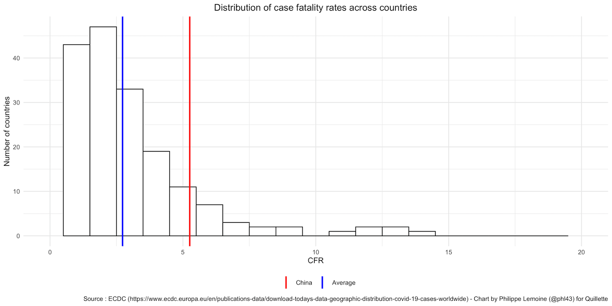
Countries with a lower case fatality rate than China include developed countries such as South Korea, Australia, and Germany. There is no legitimate reason to cherry-pick those countries most badly affected, while ignoring those where the case fatality rate is much lower. But, as we shall see, cherry-picking is a recurring problem in this debate.
More importantly, between-country comparisons of case fatality rates are largely meaningless. This is because the number of cases can vary enormously between countries for reasons that have nothing to do with the actual progress of the pandemic. Rather, the variation arises because different countries have different testing policies, different ways of defining cases, different levels of testing availability, and so on. In fact, because those variables often change within each country, even within-country case fatality rate comparisons over time are very difficult. For reasons like this, the quality of national case number data is almost universally poor, and certainly provides no reliable basis for the claim that China has deliberately and artificially deflated the number of cases on its territory.
A common argument is that, since China is home to almost 1.4 billion people, it’s highly unlikely to have had only about 84,000 cases and 4,600 deaths. The theory that China’s official death toll is underestimated is not just widespread across the political spectrum, it’s almost treated as received wisdom. The case fatality rate is just the number of deaths attributed to COVID-19 divided by the number of cases, so if China has underreported cases and deaths in roughly the same proportion, the case fatality rate could easily be within the range observed in the rest of the world even though China’s figures are completely bogus.
Another way to approach this problem is to separate the number of deaths from the number of cases and compare both as a proportion of each country’s population. Let’s start with the number of cases:
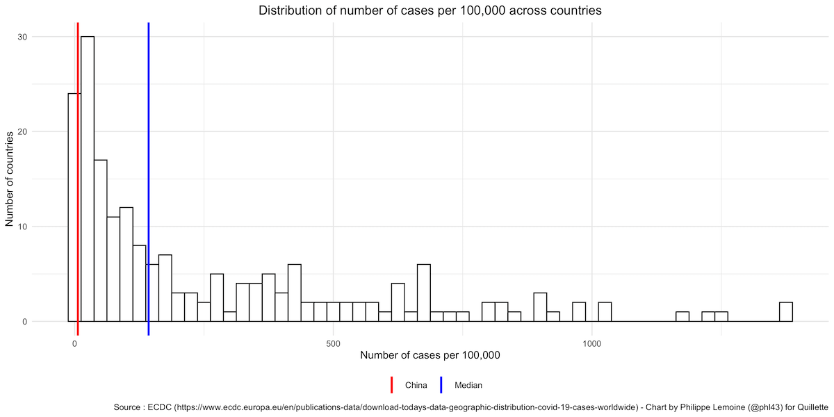
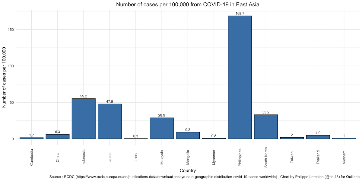
As you can see, China’s official number of cases per 100,000 is definitely on the low end, but there are plenty of countries with a similar or lower number of cases per 100,000 (it’s lower in 14 countries out of 208 in the dataset), so there is nothing particularly suspicious about it. This becomes even clearer if, instead of comparing China to every other country, we only look at countries in East Asia. This makes sense because the number of cases per capita is correlated within region, while there are stark differences between regions. Compared to its neighbours, China’s number of cases per 100,000 is unremarkable since almost half of the countries in that region have a lower number of cases:
As I’ve already noted, the number of cases in a country is a very noisy indicator, because it’s affected by all sorts of things that have nothing to do with the extent of the epidemic in that country. Nevertheless, if the Chinese government deliberately underestimated the number of cases in China, it’s hardly obvious by looking at the numbers.
The number of deaths ought to be a better indicator, because there’s less room for differences in definitions and policies to bias the comparison. Moreover, data about deaths are harder to manipulate, because dead people tend to get noticed. However, that is not to say that data about deaths are perfect, and there is plenty of noise even in the absence of deliberate manipulations. Not all countries have the resources to systematically test for SARS-CoV-2 in the recently deceased, which can make a comparison misleading even if no one is trying to fudge the figures. And even if every recently deceased person were tested everywhere, some countries will attribute any death to COVID-19 if the deceased tested positive, while others will try to determine the cause of death and only attribute a fatality to COVID-19 if they decide the person would not have died had they not been infected. These caveats notwithstanding, data on the number of deaths is probably not as noisy as data on the number of cases, so let’s see how China’s number of deaths per million compares to that of other countries:
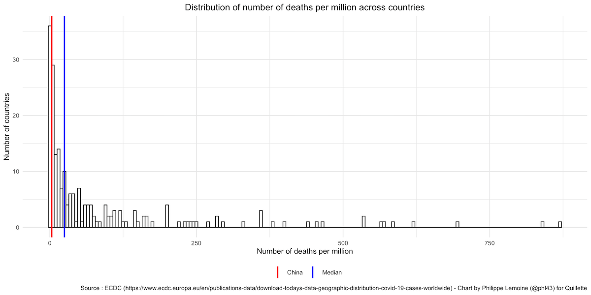
As with the number of cases per capita, it’s on the low end, but many countries have a similar or even lower number of deaths per million (it’s lower in 40 countries out of 208 in the dataset), so China’s official death toll is hardly the red flag people think it is. And if we just compare China to its neighbours instead of the entire world, it becomes even less exceptional, since more than half of the countries in East Asia have fewer deaths per million than China:

Across East Asia, the number of deaths attributed to COVID-19 is remarkably low compared to Europe and the US. Of course, if you compare China to Italy or Belgium, it’s going to look suspicious, but this is only because you’re comparing it to outliers.
Besides, looking at the number of cases/deaths per capita is no panacea and can even be misleading. If one country has twice as many inhabitants as another, it doesn’t necessarily follow that it will have twice as many cases and suffer twice as many fatalities. This could only be expected if the virus appeared uniformly throughout a country, but it doesn’t. It first appears in one or more places—either because that’s where it originated (as in Wuhan) or because it was introduced from elsewhere—and then it spreads unless something is done to prevent it.
Compared to most other countries, China has a vast landmass and a huge population. But the virus has mostly been contained in Hubei and, even more specifically, in the Wuhan metropolitan area. This area is only home to between 0.8 and 4.1 percent of the Chinese population, depending on whether you include Wuhan itself, the surrounding metropolitan area or the province of Hubei. However, when looking at the number of cases/deaths per capita, we are dividing the number of cases/deaths by the entire population of China. This is bound to make China look better than most countries because most countries aren’t as large, so once the virus began circulating in one region, a much larger proportion of the population was at risk. For instance, having established itself in the region of Paris, the virus effectively threatened 18 percent of the French population. But when people compare the number of cases/deaths per capita in China with the number of cases/deaths per capita in France, people will routinely divide the number of cases/deaths in both France and China by their entire respective populations, as I have done here. Thus, even if France’s response to the pandemic had been more competent than China’s (which it assuredly was not), this alone would have resulted in a higher number of cases/deaths per million.
In almost every country, different regions are diversely affected by the pandemic, because the virus is not introduced everywhere simultaneously. Once things first start to go bad in the region or regions where the virus is circulating on a large scale, the government and people start taking steps to slow the spread by restricting movement, practicing social distancing and so on. The result is that regions where the virus was first introduced tend to be hit quite hard, while others are barely affected. This will bias a comparison that looks at the number of cases/deaths per capita against large countries with a large population distributed across many different areas. Now, in spite of what the official figures indicate, a lot of people insist that the Chinese epidemic was very serious outside Hubei. But that’s simply not true. Even if we allow for government manipulation of the numbers and the noisiness of COVID-19 data, it still ought to be obvious that nowhere else in China was hit nearly as hard as Hubei.
Had the authorities been forced to build a hospital in another province with the urgency that they constructed one in Wuhan, it’s hard to believe nobody would have noticed. Indeed, when there was a resurgence of the epidemic in Beijing recently, everyone immediately knew about it. Using phylogenetic evidence, a recent study of the epidemic in Guangdong, China’s most populous province, showed that most infections were imported from elsewhere and that local circulation was extremely limited. This is compelling evidence that, as the official figures suggest, China was able to limit the spread of the virus outside Hubei. In almost every country, it’s also the case that some regions were far more badly affected than others, but most countries are not as large and populous as China, so as I explained above, dividing the number of cases/deaths by the whole population is going to make the comparison with them misleading.
If we compare the number of cases per 100,000 in the rest of the world with the number of cases per 100,000 in Hubei, this is what it looks like:
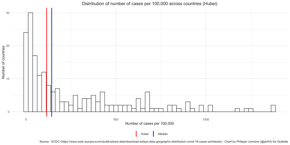
As you can see, while the number of cases per 100,000 in China as a whole is on the low end compared to other countries, the number of cases per 100,000 in Hubei is just slightly below the median of the rest of the world, since 95 countries out of 208 in the dataset have fewer cases per 100,000.
Similarly, if we compare the number of deaths per million in Hubei with the rest of the world, we see that it’s well above the median since 148 countries out of 208 in the dataset have fewer deaths per million:
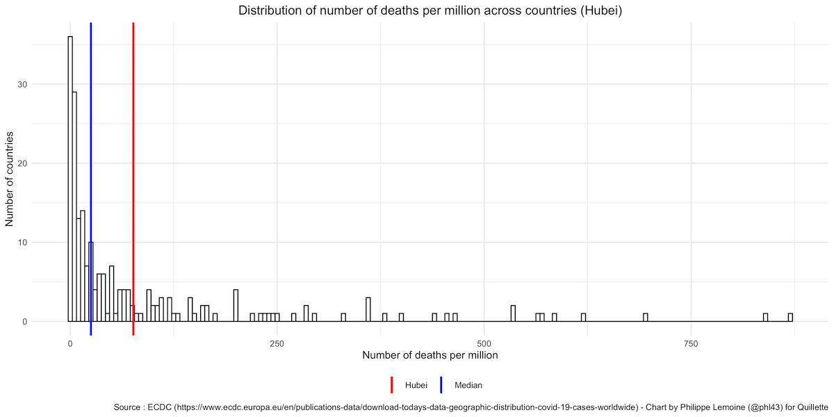
Now, this comparison is not fair either, because Hubei was the worst affected region in China. If we were to compare the number of cases/deaths per capita in Hubei with the number of cases/deaths per capita in the worst affected regions of other countries, China would look a lot better. Nevertheless, comparing Hubei to other countries illustrates just how misleading it can be to compare countries that differ vastly in size and population density, even if you try to make the comparison fairer by looking at the number of cases/deaths per capita.
If we were to ask a cave-dwelling hermit to look at the official figures for every country and guess which one had been cooking its books, he would almost certainly not pick China, but more likely a country like Vietnam or Taiwan, which are clear outliers. Nevertheless, it is claimed that China obviously faked its epidemic data because it’s not possible to contain the virus to the extent the official figures suggest. But this argument is simply question-begging, because the extent to which China was able to contain the outbreak within its borders is precisely what is at issue. If the effort to contain the virus wasn’t as successful as the official figures suggest then, obviously, the figures in question are not accurate. A demonstration that China manipulated the data about the outbreak requires independent evidence for that claim, and it won’t do to just repeat the claim in a different way. But that’s all people seem to offer on this point.
Given the extraordinary lengths to which the Chinese government went to suppress the virus once the occurrence of sustained human-to-human transmission was acknowledged, it’s not particularly surprising that the outbreak was quickly brought under control in Hubei and that circulation of the virus was very limited in the rest of the country. I don’t think most people in the West realise just how extreme China’s containment measures were, but this Twitter thread by Nicholas Christakis offers an illuminating overview—certainly, they were far more restrictive than anything imposed anywhere in the West, and much more strictly enforced. This should not surprise anyone given the nature of the Chinese regime.
Furthermore, although the severity of lockdown policies varied from region to region, they were by no means limited to Hubei. According to a New York Times analysis published in April based on announcements made by provinces and major cities, residential lockdowns of varying strictness then covered a staggering 760 million people—more than half the country’s population. Christakis and his team estimated that more than 930 million people—two-thirds of the population—were subjected to movement restrictions of some kind. And while testing capacity was insufficient in Wuhan early on, in the rest of the country, where the authorities were not caught by surprise to the same extent, testing seems to have taken place on a massive scale. According to the paper on Guangdong, 1.6 million tests were conducted in the province between January 30th and March 19th, only 1,388 of which came back positive. So the rate of positive tests during this period was less than one percent, which is far lower than almost anywhere else and indicates that testing was very extensive.
 Matt Johnson
Ben Hunt’s theory
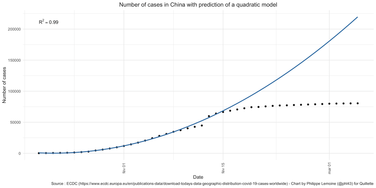
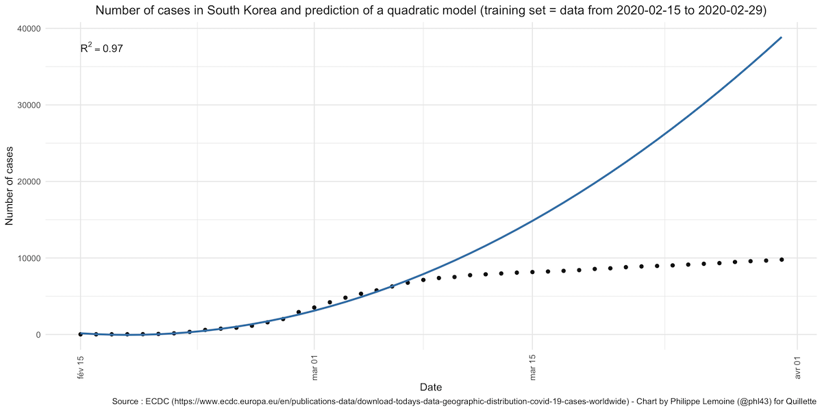
This thread on Reddit has been widely cited as evidence that China’s data have been falsified, and this blog post by a political scientist named Ben Hunt, which summarises the same argument, has also received a lot of attention. The author of the original Reddit post showed that, if we train a quadratic model on China’s official data about the number of cases between January 20th and February 4th, the fit is almost perfect. The prediction of the model remains pretty good for a few days after February 4th, before diverging radically as the number of new cases rapidly drops:
The same thing happens if, instead of looking at the number of cases, we look at the number of deaths using data between January 20th and February 4th as our training sample. The prediction is pretty good for a few days, then starts underestimating the number of deaths by a few hundreds and eventually starts wildly overestimating the number of deaths as the fatality rate begins to decelerate rapidly around February 24th:
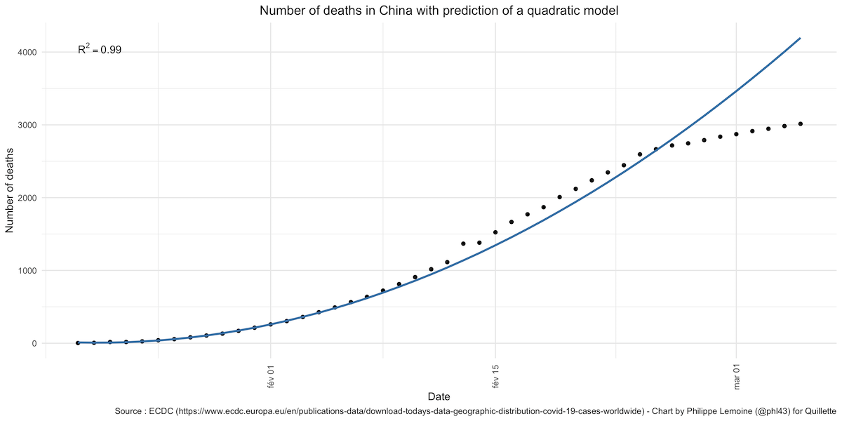
The model’s predictions don’t remain accurate for very long and are not really accurate at all unless we arbitrarily focus on just one part of the curve. When this is pointed out, people like Hunt reply that it’s “what you’d expect from a politically adjusted epidemic model over time… at some point you have to show a rate-of-change improvement from your epidemic control measures.” Be that as it may, it’s also exactly what you’d expect to see if China had suddenly taken radical steps to bring the epidemic under control, which is precisely what it did. This is not evidence of fraud, it’s just sloppy analysis presented as evidence of fraud, which is not the same thing at all. Hunt has not, as far as I know, accused South Korea of fraud, but the case rate predicted by the model fits much the same pattern:
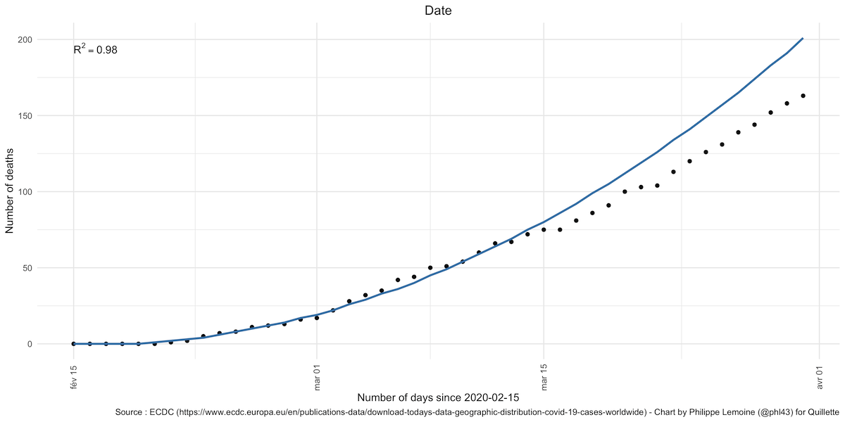
When looking at the number of South Korean deaths, the model remains relatively good for a longer period of time, but if we looked at it beyond April 1st, the number of deaths would also collapse:
Besides the divergence of the model’s predictions and the official figures, Hunt claims that it “should be impossible” for the quadratic model to fit the case numbers in the early period of the epidemic because, until they are brought under control, epidemics are exponential not quadratic. The problem with this claim is that 1) it’s not true and 2) even if it were, Hunt’s conclusion still wouldn’t follow. First, the early growth dynamics of epidemics are only exponential in naive epidemiological models. More sophisticated models (that don’t, for instance, assume homogenous population mixing) predict sub-exponential growth patterns even in the absence of factors that mitigate the transmission rate over time. This is often what data about the early phase of real epidemics show. So the fact that a quadratic model fits the Chinese data during the early stages of the outbreak is not particularly surprising and certainly isn’t evidence that China manipulated the data.
Even if it were true that, during the early phase, epidemics always grow exponentially, the fact that China’s official data (and South Korea’s) fit a quadratic model during this period doesn’t mean the data have been fudged. Indeed, even if the actual number of infections and deaths grew exponentially in the early phase, this wouldn’t necessarily be reflected in the number of recorded infections and deaths. As I have already pointed out, even in the absence of deliberate manipulations, data about the number of cases and even deaths are very noisy. Case data, in particular, may say more about the state of a country’s testing capacity than about the actual number of infections, especially in the case of a novel pathogen for which there is no existing stock of reagents needed for testing by PCR. So, while Hunt’s argument may look convincing prima facie, it doesn’t actually prove anything.
Benford’s law
A few months ago, some people analysed the official Chinese data to see if they obeyed Benford’s law and found that they didn’t (here is one example). This strengthened the already widespread belief that China was lying about how bad its outbreak was.
Benford’s law states that, in many naturally occurring numerical datasets, the leading digit—that is, the first digit in a number that is not zero (e.g., 3 in 345)—occurs with predictable frequency. This is counterintuitive—one would expect leading digits in datasets to be distributed randomly, but Benford’s law predicts that 1 occurs most frequently, with 2 through 9 declining in frequency in a specific way. There is no theoretical reason to expect data to obey this law—it’s just that, as a matter of empirical fact, they often do. Consequently, Benford’s law has been successfully applied to detect fraud in elections, finance, accounting, etc.
If we knew that, in the absence of fraud, the number of cases/deaths attributed to COVID-19 should grow exponentially, there would actually be a reason to expect the data to obey Benford’s law. However, as I’ve just noted, there is no reason to expect the number of cases/deaths to grow exponentially, even in the early phase of the epidemic. Insofar as the failure of a country’s official data to obey Benford’s law is suspicious, it’s only because the law often seems to hold even though we generally don’t know why. This means that, even if a country’s data about the COVID-19 epidemic don’t obey Benford’s law, it would hardly be conclusive evidence that it engaged in fraud. On the other hand, my sense is that it wouldn’t be easy to fabricate epidemic data that obey Benford’s law, so the fact that a country’s data obey Benford’s law, while hardly conclusive, offers some evidence that it didn’t engage in fraud.
Several papers have since reanalysed China’s data (here, here, and here) and concluded that they did obey Benford’s law after all. For good measure, I conducted my own analysis using the daily number of new cases/deaths according to the ECDC. As you can see below, where I show the result for the daily number of new cases in a selection of countries, it confirms that not only did China’s data obey Benford’s law, but it did so better than the data from any other country (this is probably because it has more days of data since the pandemic started over there):
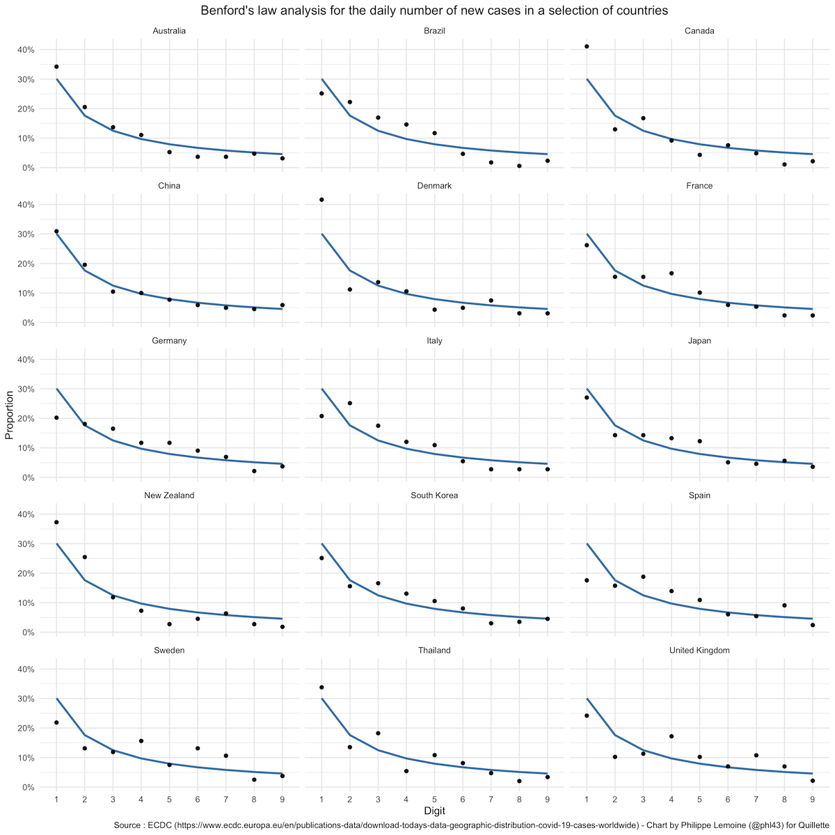
A chi-square test leads to the rejection of the hypothesis that the data-generating process obeys Benford’s law in Brazil, Canada, Denmark, France, Germany, Italy, Japan, Spain, Sweden, and the United Kingdom. The p-value is also suspiciously low in New Zealand and Thailand.
Here is another chart that shows the result of the analysis for the daily number of new deaths in the same countries:
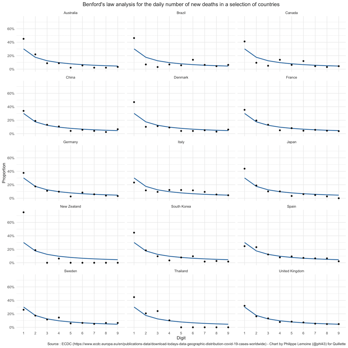
Once again, China’s data obey Benford’s law, but a chi-square test suggests a violation of that law in Australia, Brazil, Canada, Denmark, Italy, Japan, New Zealand, and South Korea. The p-value is also suspiciously low in Thailand.
Since we have no theoretical reasons to expect the data to obey Benford’s law in any country, it doesn’t show those countries engaged in fraud and I don’t believe they did. In the full dataset, Benford’s law is violated in about 42 percent of the countries for the number of cases and 56 percent of them for the number of deaths at the conventional level of significance, which suggests that it’s not a good test of fraud in the case of the COVID-19 pandemic. Nobody is about to accuse Denmark or New Zealand of fraud on the basis of this analysis, but that’s exactly what everybody would have done had China’s data violated Benford’s law. There is no good reason for this double standard.
Evolving definitions and methodologies
At the beginning of April, the Chinese health authorities announced they would start including asymptomatic cases in the official number of cases they release every day. This announcement renewed speculation that China had been deliberately manipulating its numbers to make the epidemic seem contained when it wasn’t really under control. However, China’s exclusion of asymptomatic cases from its figures had been known about since February and was the subject of a fair bit of media discussion at the time. The New York Times published a story about it on February 12th, and Nature published a piece about it on February 20th, in which some experts were critical while others argued that the practice made sense.
Keep reading

Charlie Is My Darling

Why Soccer Is Boring


How a Hidden Songbook Survived the Holocaust